![]()
Station platform signage began simply as a way of identifying what stop a train had arrived at. Later, when the CTA instituted the A/B skip stop system, the signage became more complex and took on new significance. Now that the A/B system has been abandoned, the current signage is simpler, though it has yet to be installed systemwide. Below are explanations of the various signs, with actual photos wherever possible.
In each of the signage systems below, a large number of various auxiliary signs accompanied the station name signs. However, because of the numerous and varied nature of these auxiliary signs, they are not covered by the following explanations.
The Original Signage (1892-1977)
|
|
|
|
|
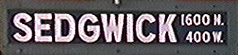
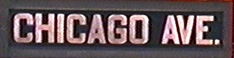
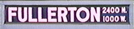
When the "L" lines began operation, all stations had the same type of station sign: dark blue enamel with white block letters, framed by a wood border. Photographic evidence indicates that all four "L" companies employed this style, which is interesting, considering that for years the lines were not in any way connected. (Perhaps they figured they'd someday unify.) The signs were long horizontally, the forerunners of what are today called "name signs" (as opposed to "symbols signs", which will be discussed later). These rather attractive signs stayed in widespread use until around 1977, though a few random examples have survived. It is said that one remained at Wentworth until the station closed in 1992. One still stands on the far east end of the northbound platform at Sheridan.
Although these signs remained more or less consistent throughout the years, as in most Chicago transit signage, there were some variations in this system. Some stops' station name signs had the station's address coordinates (for instance, Sedgwick, Bryn Mawr, Fullerton and Pulaski/Lake) and others didn't (like Chicago, Armitage, 22nd & Mannheim and 63rd Street [later Harvard]). It is known that the signs without coordinates predate the ones with. The likely explanation here is that at some later date - possibly when the CER began in 1911 or when the Chicago Rapid Transit took over in 1924 - newly minted signs had the addressed added. Often, a station with platform extensions would bear the older coordinate-less signs in the older part of the platform while the extension(s) would have the new coordinate signs. This pattern would seem to indicate that the older signs remained in use, while the newer signs simply supplemented the older ones where necessary.
State/Dearborn Subway Signage (1943-Late 1970s)
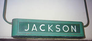
Examples of various
State and Milwaukee/Dearborn station signs. The background
colors are conjecture: they may have universally been gray
or may have conformed to each station's signature "color"
(in Jackson's case, green).


![]()
When the State Street Subway opened in 1943, it had its own system of signage, which different completely from the signs in use on the older elevated lines.
Posted on the outer walls (opposite the platform) were signs that identified the name of the station. These consisted of a long, rectangular sign with the station's name spelled out in all capitals. Although these were similar in design to the original blue and white name signs, they were smaller (about half the size) and used a different typeface. A new type of smaller sign supplemented these. Roughly square in shape, these signs had the first letter of the station's name in large type, supplemented by the full name.
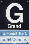
There seem to have been several different types of these signs. It is unclear why or how many variations there were, but at least three are known. One type, used at Washington/State, had a large first initial ('W') in the center, interrupted in the middle by the full name of the station in smaller print. A second type, used at Jackson/State, had a large first initial ('J') in the left center, followed by the rest of the station name in smaller type across the center. A third type, seen at Grand/State, had a large first initial ('G') in the top center, with the station's full name below it in smaller letters. These signs were the predecessors of the later "symbol signs" (introduced in 1948) with their use of a large-type first letter of the station name for easy, quick identification.
It is also unclear what background color these signs used. All other auxiliary signage in the subway (emergency exit signs, no smoking signs, rush hour stop signs, etc.) used white letters on a light or medium gray background. It would seem probable that these did as well. However, some evidence exists which suggests that the background color of the station signs matched the "color" of the station. (Although all subway stations were predominately white in color, the accents &endash; tile borders, inlaid tile lettering, etc. &endash; were a different color for different stations to help with quick identification. There were four accent colors &endash; red, blue, green, and brown &endash; which rotated through the subway.) Thus, the background of the station signs at Jackson/State may have been green, not gray. (In an interesting aberration, the auxiliary signs at Clinton/Congress [still in place] are white and blue [the station's "color"] instead of white and gray. However, since Clinton was finished seven years after the rest of the Milwaukee-Dearborn Subway [and 15 years after the State Street Subway], it may not have conformed 100% to the original subway signage scheme.)
In addition to these wall-mounted metal and painted signs, there were two additional types of sign identification used in the State Street and Milwaukee-Dearborn Subways. One was a type of backlit hanging sign, identified in the subway engineering plans as a "Type 'F' Illuminated Sign". (Nearly identical "Type 'E' Illuminated Signs" were used at Washington/State.) The metal casing was a roughly rectangular box, with rounded art moderne ends and windows on the two long, front sides. Each window had a glass sign in it with the station's name. Although most of these signs have been removed, a few remain, such as those at Clark/Division and Clinton/Congress. The ones that do remain, however, have had the back lit panels replaced with ones in which the station's name is in newer Helvetica lettering, not the original typeface.
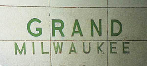
The second type of additional station identification was inlaid into the wall tiles themselves. On the solid tiled walls of the subway stations (next to and behind the stairs, on the platform, at island platform stations; on the platform wall at side platform stations), the name of the station was inlaid into the tiles at a height of about five-to-six feet off the ground. The letters conformed to the station's "color" and there were two types of layouts. The most common was used in the entire Milwaukee-Dearborn Subway and in the State Street Subway between Roosevelt and Washington: the stations name in big letters (e.g. "WASHINGTON"), with the cross street below in smaller letters (e.g. "State"). At the other four State Street stations, the cross street and parallel street were given equal billing and separated by an ampersand (e.g. "CLARK & DIVISION"). These tiled names are still visible at all island platform stations that have not been refurbished. At Grand and North/Clybourn, they are covered by newer metal K-D-R name signs, but are left in situ. They have been removed from Chicago as part of that station's reconstruction.
Top Left: A hanging
"Type 'F' Illuminated Sign", with its original name plate.
The color of the box and sign conform to Jackson/State's
signature "color". Bottom Left: Inlaid
tile station name at Grand/Milwaukee on today's Blue Line.
Like above, the color of the letters conform to Grand's
signature "color". (Photos by Graham
Garfield)
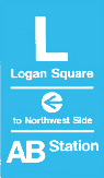
The Original A/B Signage (1948-1977)
|
|
Variants of the name signs from the original A/B signage scheme. The Medical Center sign is representative of those commonly found along the Congress Line. |
A/B station sign variants |
 The
earliest A/B station signs (seen at left) were temporary, simple, and
quickly produced to be ready in time for the implementation of
skip-stop service. These were painted on-site, often on an existing
surface by first putting down a rectangle of the background color,
then adding the lettering, often with a stencil. These temporary
signs were fairly widespread and used the colors adopted for the A/B
train destination signs and for the later, formalized A/B signs: A
stations in maroon/red or yellow, B stations in green or blue. What
colored was used for A/B and All-Stops is uncertain; these stations
may not have had A/B signs originally.
The
earliest A/B station signs (seen at left) were temporary, simple, and
quickly produced to be ready in time for the implementation of
skip-stop service. These were painted on-site, often on an existing
surface by first putting down a rectangle of the background color,
then adding the lettering, often with a stencil. These temporary
signs were fairly widespread and used the colors adopted for the A/B
train destination signs and for the later, formalized A/B signs: A
stations in maroon/red or yellow, B stations in green or blue. What
colored was used for A/B and All-Stops is uncertain; these stations
may not have had A/B signs originally.
These early, temporary signs were superseded in the late 1940s or early 1950s by new symbol signs which gave the same information, plus the name of the station as well as the train's direction and destination. They were based, in part, on signage used in State Street and Dearborn Subways (see above). They gave the first letter of the station name (or the street number, for the numbered streets) in large type at the top, with the full name of the station below it. Below this, a colored bar using the above color-coding scheme showed what type of stop it was, along with the A or B symbol associated with it. (On maps and train signs, the "A" was usually surrounded by a triangle, while the "B" was surrounded by a square.) AB stations had two bars, one for each type of train that stopped there. Below this, on the bottom, was the direction and destination of trains stopping at that platform.
There were quickly a number of variants to this system, as the CTA seemed to enjoy experimenting with different types of signage. One common variation to the large-letter-on-top/full-name-below signs were those in which this was replaced by the name fully spelled out and set on a diagonal on the sign. There are several theories as to why this might have been done (beyond the simple explanation of random experimentation), though popular wisdom holds that is was usually one of these three:
These theories tend to hold out most of the time, but not 100% of the time. Halsted/Lake, for instance, had diagonal A/B signs, but fit none of the above criteria. Apparently, at least some were done just for the heck of it.
A third variation of the A/B symbol sign was one in which the large-type first initial was interrupted in the center by the full name of the station. Unlike the majority of the signs in which the name was below the initial, these resembled the signs of the subways in which the name cut through the center of the first initial (such as those at Washington/State). These signs seemed to have been rare, but were used in places such as California/Lake and Cicero/Congress.
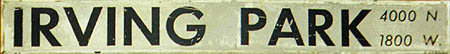
Although the symbol signs made up the bulk of this signage scheme (the A/B skip-stop information provided on them was need at nearly every station on the system and in multiple quantities at each location), some station name signs were also drawn up in this scheme. Although more rare, they consisted of black lettering on a white background and included the station's address coordinates in smaller type in italics on the right-hand side. At stations with more than one exit, the various exits were noted at the ends of the sign, with a red arrow pointing in the referenced direction. The line to receive the bulk of these signs was the Congress Line: since it was completed in 1958, it had to be entirely equipped under the reign of this scheme and thus all of its signs were of this type, originally. One of these name signs remained at Medical Center until its belated removal in spring of 2000.
These signs were silk-screened on aluminum plates by personnel at the Skokie Shops in a technique similar to how they prepared train destination roll sign curtains, which were silk-screened on linen. Art for the screen was prepared in the Staff Engineer's Office using a commercial cardboard type that was handset face down in a metal composing stick. The spacing of the lettering was automatic because of the width of the cardboard blocks, but if you had an overlapping letter combination (such as at Clark & Division, where the letters were specially drawn with the "C" and "D" partly overlapping), it was kerned by hand with an artist's knife.
All of these signs used the Futura typeface and condensed variants of it. The last group of signs to be prepared using this design and type were those for the Englewood extension in 1969, although the same year the new Dan Ryan Line introduced a new type of signage...
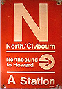
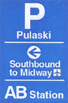
The "K-D-R" A/B Signage (1977-Present)

 |
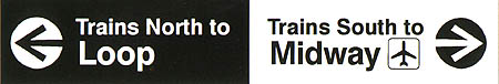
Above: Station name sign variant (AB Station) Left: Station "symbol" sign variant (AB Station) Right Above: Standard station name signs (Top: A station; Bottom: B station) Right Below: Standard station "symbol" signs (Left: A station; Right: B station) |
|
When the Dan Ryan and Kennedy Lines were put into service in 1969-1970, the CTA decided to test a new type of signage at the lines' stations. The CTA introduced what came to be known as "K-D-R" signage (so named for "Kennedy-Dan Ryan", its testbed lines). Now, color-coding used as the signs' background would indicate an A station (red), a B station (green), or an AB or All-Stop station (blue). The typeface would be Helvetica medium, found to be the most effective for CTA signs in the Dan Ryan and Kennedy experimental signage. Instead of the previous style of using only capital letters, upper and lower case letters were used to improve readability in addition to the use of the Helvetica font. This series of signs made another interesting change that has remained to this day: whereas the word "and" in a station name had previously been symbolized by an ampersand (such as at "North & Clybourn"), it would now be symbolized by a backslash (such as at "Clark/Lake" or "Adams/Wabash"). (The Dan Ryan signs were also peculiar in that they gave much more play to the long name "Wentworth" than to the numbered street that the station was actually named for, not to mention the fact that the stations were actually nearer to the Dan Ryan Expressway than Wentworth or State Streets.)
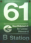 The
basic forms remained: horizontally long rectangular signs bearing the
station's name and address coordinates supplemented by smaller
vertically-rectangular symbol signs, posted at the passengers' eye
level, displaying the station name, station type and the destination
of trains serving that particular platform.
The
basic forms remained: horizontally long rectangular signs bearing the
station's name and address coordinates supplemented by smaller
vertically-rectangular symbol signs, posted at the passengers' eye
level, displaying the station name, station type and the destination
of trains serving that particular platform.
The "experimental" signs on the Dan Ryan and Kennedy Lines were successful and afterward the signs were quickly spread to important locations such as Howard and many downtown stations. In 1977, as part of a systemwide program of sign modernization to facilitate a "stepped up campaign of transit marketing," the project extended "these new graphics to 142 more stations, each carrying 75 to 100 different signs" in a federally funded program. (To see an article from CTA Quarterly magazine -1st quarter, 1977 issue - on the new signage, click here.)
To incorporate the symbolism of the background color more fully, the background of other signage at these stations often conformed to the facility's skip-stop designation. For instance, the background of the station name and symbol signs at Western/Milwaukee were green (since it was a B Station), but so was the background of that station's system maps and other auxiliary signage.
 There
were some variations in the signage from station to station. At most
stations (especially older ones), the symbol signs measured 18" tall
by 12" wide. The poles and supports they were connected to were
generally in the range of 6"-8", so they hung over the sides. (Of
course, when they were flat against a wall or partition, it was a
moot point.) However, some of the newer stations (i.e.
Loyola,
Granville,
and the Dan Ryan Line stations to name just a few) had white steel
poles that measured about 9" square and apparently the CTA decided
that these stations' signs should be flush with the poles. Therefore,
some stations had symbol signs that were smaller, measuring 14" tall
by 7.5" wide. Often, to accommodate this reduced width, the
directional arrow was above the route destination instead of beside
it. Station name signs at these stations were generally
unaffected.
There
were some variations in the signage from station to station. At most
stations (especially older ones), the symbol signs measured 18" tall
by 12" wide. The poles and supports they were connected to were
generally in the range of 6"-8", so they hung over the sides. (Of
course, when they were flat against a wall or partition, it was a
moot point.) However, some of the newer stations (i.e.
Loyola,
Granville,
and the Dan Ryan Line stations to name just a few) had white steel
poles that measured about 9" square and apparently the CTA decided
that these stations' signs should be flush with the poles. Therefore,
some stations had symbol signs that were smaller, measuring 14" tall
by 7.5" wide. Often, to accommodate this reduced width, the
directional arrow was above the route destination instead of beside
it. Station name signs at these stations were generally
unaffected.
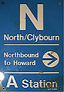
North/Clybourn symbol sign variants |
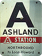
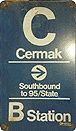
The K-D-R standard worked well in that it introduced a new, consistent signage scheme systemwide. Problems cropped up in it, however, when service changes were not matched with corrected signage. A common problem occurred when a station changed its skip-stop type. (For instance, North/Clybourn was originally a B station with green signs, but after Belmont became an AB Station in 1979, North/Clybourn became an A stop). The station name signage usually wasn't changed (since its text information remained the same), but the symbol signs usually were. This meant that the colors were mismatched and thus became confusing and meaningless for the uninitiated. Thus North/Clybourn now had green station signs (indicating a B Station) but red symbol signs (correctly indicating an A Station). (North/Clybourn later got blue symbol signs, seen at right, but remained an A station. For more on the reason for this, see below.)
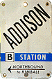
In other instances, such as on the Kennedy extension, both the name and symbol signs were left in place, but the skip-stop type was covered over by a vinyl sticker. Thus, after a change in stopping patterns, Irving Park and Belmont (previously B Stations) have green AB signs and Addison (previously an A Station) has red B Station signs.
Some signage color variations, however, were completely unintentional. The ultimate in a color variation were the signs for Halsted/Lake (a B Station) that came out in red, and Ashland/Lake (an A Station) in green on the Lake-Dan Ryan Line. Why the mix up? For the first time, the colors were specified by Pantone numbers (a system that was new then) and somebody got the numbers switched!
For passengers, a very confusing situation indeed!

|
 |
|
Examples of signage conforming to the Modified K-D-R Standard. The station name and symbol signs would be blue for any station here, regardless of its stopping pattern. |
|
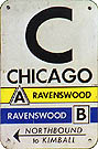
In light of the above signage consistency issues and other service changes, a Modified K-D-R system was implemented in the early 1990s. At this point, the CTA abandoned having the signs' color match the station type. From this point on, regardless of what skip-stop type they were, all stations had symbol signs with blue backgrounds. Some of these mismatched stations include Addison, Cermak-Chinatown (seen above left), North/Clybourn (seen above right; it seems North/Clybourn had been riddled with inconsistencies!), and Racine/63. The overall design of the symbol signs seems to have been unaffected and the station name signs also remained unchanged (except for now always being blue and white). The majority of the changes occurred in the myriad of auxiliary signs that also exist throughout the "L" system.
These signs are still used over the majority of the "L" system, although the color-codes don't mean anything now that the A/B system has been discontinued. The CTA is currently in the process of replacing them with a new signage system.
Current Graphic Standard (Gray) Signage (1995-Present)

|

 |
|
|
|
|
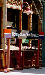
A new-style sign at the new Library-State/Van Buren station. The colors indicate that the Midway (Orange) and Evanston Express (Purple) Lines stop at that platform. |
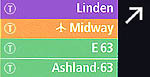
One touch that has become common on the new name signs is the use of a symbol or logo in the colored "tab" to indicate the geographic location or nearby landmarks of the station. For instance, Grand/Milwaukee's include a Navy Pier logo, Rosemont's use the Rosemont city seal, and Roosevelt/State's incorporate a museum campus logo. This trend will spread as additional stations receive the new name signs.
 These
signs have, so far, only been installed where new signs were needed.
They are most visible on the Green Line, which had a major overhaul
in 1994-96. Where the old A/B signs are still usable, they've been
left alone, though the new ones are slowly showing up at seemingly
random stations. Among the stations that have received new symbol
signs are Loyola,
Madison/Wabash,
Adams/Wabash,
and Clark/Lake.
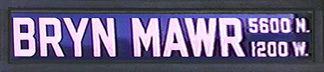
Those that have gotten new name signs include Bryn
Mawr and Thorndale
on the Red Line. A number of stations, such as Roosevelt/State,
LaSalle/Van
Buren, Randolph/Wabash,
Chicago/Franklin,
State/Lake,
Rosemont,
Grand/Milwaukee,
and a few others have received completely new station signage in the
new scheme.
These
signs have, so far, only been installed where new signs were needed.
They are most visible on the Green Line, which had a major overhaul
in 1994-96. Where the old A/B signs are still usable, they've been
left alone, though the new ones are slowly showing up at seemingly
random stations. Among the stations that have received new symbol
signs are Loyola,
Madison/Wabash,
Adams/Wabash,
and Clark/Lake.
Those that have gotten new name signs include Bryn
Mawr and Thorndale
on the Red Line. A number of stations, such as Roosevelt/State,
LaSalle/Van
Buren, Randolph/Wabash,
Chicago/Franklin,
State/Lake,
Rosemont,
Grand/Milwaukee,
and a few others have received completely new station signage in the
new scheme.
Under the new signage standard, a number of the auxiliary signs have also been redesigned.
|
Examples of the new Frankle-Monigle signage scheme. These are draft designs; the final versions will change to some degree. For instance, the CTA chose not to replace the backslash ("/") between streets in station names with the dot ("•") as proposed by Frankle-Monigle. Also, the plain "L" on the Marker will most likely be replaced by another logo. Above: Clark/Lake Station Identity Sign |
The Current Design Standard is, however, an outgrowth and modernization of the existing KDR signage system, first implemented in 1969-70 in a pilot program on the Kennedy and Dan Ryan Lines and implemented systemwide in the 1970s. Some at CTA have recently desired to create an all-new signage scheme for the CTA's rapid transit system, with a new, decidedly modern look and a unified graphic design that is both international in understanding and which may possibly be integrated with new bus signage in the future. To do this, the CTA decided to seek outside assistance.
|
The Breadcrumbs:
Below: Clark/Lake Intimate Marker 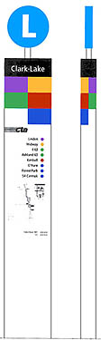 |
The pilot program for the Frankle-Monigle signs is being conducted at the Clark/Lake station. The program is designed to develop signs that better direct customers to their destinations by displaying:
In a large sense, the Frankle-Monigle signage system consists of many parts, including:
The extent to which the Frankle-Monigle signage system is implemented at the Clark/Lake pilot site will be determined by several factors, including time, money, and the scope of the pilot program. Whether they are implemented systemwide someday, and to what extent, will depend on their evaluation and acceptance by the public and by CTA personnel at the pilot site.
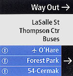
The deployment of the prototype Frankle-Monigle signage began in October 2001 with the installation of the Station Identity Signs on both the Inner and Outer Loop platforms. Also installed at this time were some of the "Breadcrumbs", including those for the teletype pay phones, elevators, and No Smoking, on the elevated platforms and in the Thompson Center station facility.. Installation continued through late January 2002, by which time most of the elements were in place. Among the later additions to be installed is the Directional/Transfer Signage, which indicate a line transfer opportunity for the rider or show the way to different exits, streets, buses, or points of interest. Also installed were information kiosks that information can be posted in and the large Station Markers, which are kiosks that draw attention to the location of "L"TM stations and provide information about the services provided at that station from street-level environments, have been installed on Lake Street outside both the Thompson Center and 203 N. LaSalle entrances.
The Frankle-Monigle signage has been installed in the Thompson Center and 203 N. LaSalle stations at the lower subway-mezzanine level, street level, and elevated platform levels. They have also been installed on the elevated Clark/Lake platforms. A set of Directional/Transfer signs have also been installed on either side of the elevator in the subway, marking the only Frankle-Monigle sign to be installed in the Blue Line subway station during the test.
![]()
Thanks to Roy Benedict, Victor Ramirez, and Charles Arndt for additional signage information.