 The
ready legibility of signs to the rider-
The
ready legibility of signs to the rider-|
CTA Sign Language |
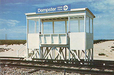
Dempster In The Desert: Regular riders on CTA's Evanston and Skokie Swift lines might be startled were they to take a ride on the track at the U.S. Urban Mass Transportation Administration's Test Center in Pueblo, Colorado. They could wonder whether the CTA Dempster station had "gone west" with them. Because of CTA's model readable graphics and design in signage, UMTA asked George Krambles, general manager, and Harold Geissenheimer, general operations manager, whether CTA would supply markings for their test system. CTA was glad to oblige, furnishing this and nine additional wayside and passenger station signs in the summer of 1976. |
The
ready legibility of signs to the rider-
The quick recognition of what signs mean by color, number, graphic symbol-
The uniformity of sign styling and appearance throughout the system-
These are important elements in the guidance of passenger traffic flow through a large urban public transportation service.
The CTA system requires some 33,000 permanent signs- on elevated platforms, at street corners, on the trains and buses, in the stations.
The science behind this signage is much more than meets the eye. Only the result meets the eye.
This science is one of the responsibilities of 11 people in CTA's Passenger Controls Graphics section. These are veteran draftsmen and seasoned graphic designers with depth experience in sign work and type styling.
Director of the section is John O'Connor, a 30-year CTA veteran, an experienced draftsman himself.
This is the core group for a systemwide program of sign modernization begun by management three years ago to facilitate a stepped-up campaign of transit marketing and to give CTA the smart, up-to-date public image its operations merit.
Destination Signs
There are three major segments to the program. One segment was completed last year with the replacement of the destination signs on the front and sides of all CTA buses. Destination signs are made up of as many as 20 different route numbers and names which appear consecutively on a roller curtain device at the front and right side of the bus, permitting the driver to change destinations as direction is reversed or as the bus is assigned to different routes.
The Passenger Controls Graphics group, working in conjunction with OTA's Maintenance Department and the sign manufacturer, Transign, Inc. provided all the specifications for the eight-month sign replacement project.
The technique employed here is to use a full height route number on the left side of each route panel, a route name in the center, and the end-of-run destination on the right side.
For example:
|
|
|
|
The large route number provides a way for riders to identify a bus arriving at a distance. Equally important, it is a means of relating the information contained in CTA system maps and bus stop information signs to the buses in the street.
The type is Helvetica1 medium, found to be the most effective for CTA signs when the Dan Ryan and Kennedy route signage was developed in 1969-70. Instead of the previous style of using only capital letters, upper and lower case letters are used to improve readability.
Station Signs
A second part of the current sign modernization program is that of implementing new and uniform graphic treatment at all stations on CTA's rapid transit lines.
The previously-mentioned Dan Ryan and Kennedy signage job was the pacesetter, providing the model.
That job involved the design, layout, and copywork for 400 different bits of information on nearly 6,000 signs.
The current project to extend these graphics to 142 more stations, each carrying 75 to 100 different signs, is a federally- funded capital development project.
Included is a rail-to-bus directional signage plan for rapid transit terminals which are hubs of rider transfer to and from several or many bus routes which feed the stations.
The idea is to make it relatively easy for a rail passenger to get from the train platform, through the terminal, out to street level, and onto the right bus.
The plan was first developed and tested at the 95th Street terminal of the Dan Ryan line and the Jefferson Park terminal of the Kennedy line. It has since been extended to the Howard Street rapid transit station, the north side terminus for several bus lines.
Color coding is employed in the station signing to indicate the stops made by trains running A schedules (red) and B schedules (green). Stations at which all trains stop are marked with signs in blue.
Bus Stop Signs
A third project underway is the renewal of the street signs marking CTA bus stops.
Involving at least 1,500 separate pieces of information, the project covers the replacement of 14,000 signs dotting the entire system. In addition to a new blue color scheme and an easier-to-read format, a feature of the signs is the use of a map illustrating the routs of a particular bus-unless, of course, there are so many routes at a stop that there would not be space for the number of maps necessary.
Temporary signs which are posted throughout the system to keep the public up-to-date are also produced by the graphics group.
These are most frequently required when there are changes in timing and routing of buses and trains or changes in fare. Temporary signs must be made when bridges are closed temporarily. Any track construction work also calls for temporary signing which is important to alert passengers to any possible inconveniences.
And Others
But signs are not the only products of the graphics group. Included also are charts, maps, paste-ups for printed reports, and informational exhibits.
The design and updating of the "car card" route maps posted in each rapid transit car are responsibilities for the graphics people. A recent job was a new printed downtown transit map, a cooperative effort with the Public Affairs Department.
Smaller, miscellaneous assignments also
come their way and are taken care of as the regular work schedule
permits. This can involve anything from company letterheads to new
menu boards for the company cafeteria.

|
 |
 |
1 Helvetica, in which this article is set, is rated by typographers and designers as one of the cleanest, most readable type faces ever developed. It delivers a message to the eye quickly and appealingly. It stands out well against all colors, either in bold face or in reverse. Helvetica has gradually come into general use throughout CTA and has acquired identification as the corporate type face.
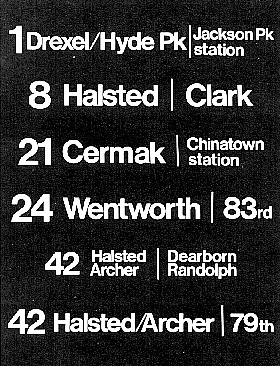
 Station
name signs, as above, appear on rapid transit station
platforms; they enable riders to determine exactly where
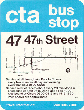
they are and which exits to use. Station symbols, left,
appear on station posts near the riders' eye level Blue
color coding shown here indicates stations where all trains
stop, red is used for A train stops, green for B train. Bus
stop sign, right, shows simplified data on routing and times
of service. New destination signs now installed on all CTA
buses, below, are printed on roller curtain to permit easy
changing; large numbers and shorter destination descriptions
are used to enable riders to become quickly familiar with
both and to connect numbers and names automatically. Another
CTA innovation is the transit information center, bottom,
used at various intermadal terminals and
locations.
Station
name signs, as above, appear on rapid transit station
platforms; they enable riders to determine exactly where
they are and which exits to use. Station symbols, left,
appear on station posts near the riders' eye level Blue
color coding shown here indicates stations where all trains
stop, red is used for A train stops, green for B train. Bus
stop sign, right, shows simplified data on routing and times
of service. New destination signs now installed on all CTA
buses, below, are printed on roller curtain to permit easy
changing; large numbers and shorter destination descriptions
are used to enable riders to become quickly familiar with
both and to connect numbers and names automatically. Another
CTA innovation is the transit information center, bottom,
used at various intermadal terminals and
locations.